You may have seen this post about joining column data. As an extension, we now can keep the column names for better readability.
Table of Contents
(almost) Standard Table View
Let us start from the beginning: This is a slightly modified but almost standard table view of tasks:

From my point of view there are too many columns and too much space wasted due to empty cells. Also, there are tuples or triplets of columns belonging together, for eaxmple created_on and created_by.
Joining columns
Using the new join-function, which will be available by the end of this year, we can join columns' contents into one target column per row.
Code
AppGiniHelper.TV
  .join("partner_id", ["project_id", "contact_id", "machine_id", "calculation_id", "calculationitem_id"], "Zuordnung");
Result

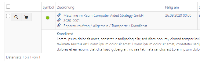
Right now we have decreased the number of data columns by 50% (from 20 to 10 columns) and content from different source columns has been merged into specific target columns, let me show this zoomed:
Table View BEFORE join:

Table View AFTER join:

Illustration of changes:

Those four columns "Projekt", "Ansprechpartner", "Maschine" and "Kalkulation" have been merged into the first column "Geschäftspartner" which has been renamed to "Zuordnung" (EN: Assignment).
Those four columns are hidden and only the target column remains visible.
Improvement
However, we have lost column names of those four hidden columns now. This makes it harder to read and understand the values in merged target column. It is harder for users to assign information in the brain.
So, I have included another boolean parameter for keeping the labels:
AppGiniHelper.TV
  .join("partner_id", ["project_id", "contact_id", "machine_id", "calculation_id", "calculationitem_id"], "Zuordnung", true);
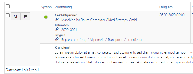
Table View AFTER join with last parameter true:

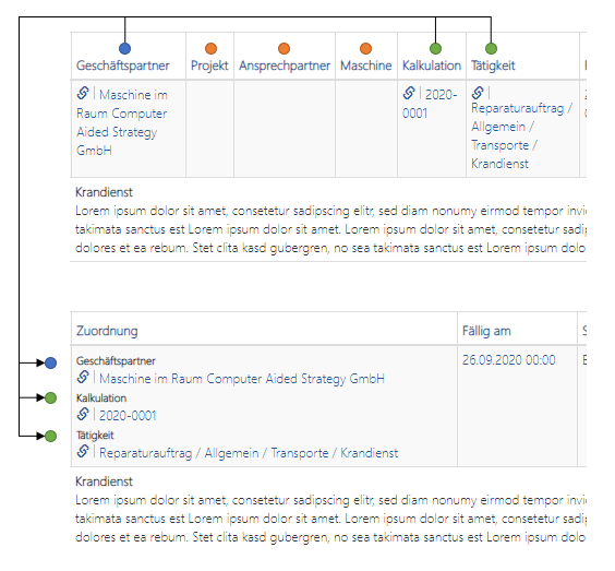
Now the labels of the (hidden) columns will be placed above the values.
Illustration of the changes:

Styling the labels
The labels can be styled using CSS like this:
.appginihelper-tv-join-label {
  color: black;
  font-weight: bold;
}
Summary
From my point of view, in some cases it is fine to just merge the values without labels. In other cases it will be easier to understand and better to read for end-users, if we include the labels. With the additional boolean parameter we can control from case to case.
I hope you like it.

