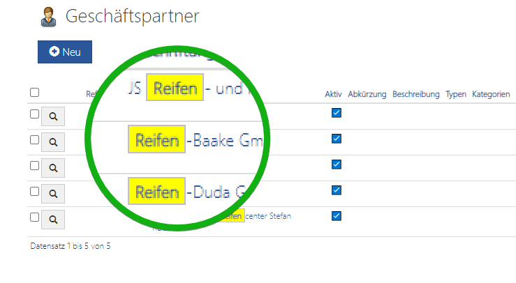
AppGini highlights hits in Table View after search. Depending on the selected theme, the hits are highlighted in color. Today I'll show you how easy it is to change the way hits are displayed when searching in Table Views.
Problem
In my theme, the search hits have so far been highlighted rather discreetly.

This emphasis is not clear enough for my taste. Therefore i have adapted the presentation via CSS.
Result


You can have different opinions about color and style. I am only interested in this post to show you the possibility. You can adapt it to your own needs with a little CSS knowledge.
CSS-Code
span[data-jquery-mark="true"] {
    background-color: yellow;
    padding: 1px 4px;
    border: 1px solid silver;
}
There are different ways in which you can integrate CSS code. I recently got used to creating my own CSS file called header-extras.css in the same directory as header-extras.php. Then, in header-extras.php, I just include my CSS file with the following line of code:
<link rel="stylesheet" href="hooks/header-extras.css" />

