In a project, I wanted to make users clearly aware that there are notes on a record. This is possible with a very simple CSS animation.
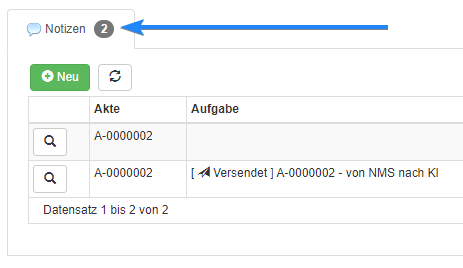
You probably already know the so-called badges for the children tabs, in which the number of records is displayed. Instructions for this are available in the AppGini Udemy course, which many of us have booked and attended to get started. Our AppGini Helper Javascript Library has a function for this (included in compact function), which is described here.

Those badges show the number or records. Anyway, if you want to draw a user's attention to it, the small grey circles might be a little too discreet.
In another project I once worked with CSS animations, and I wanted to apply that here too.

CSS Code
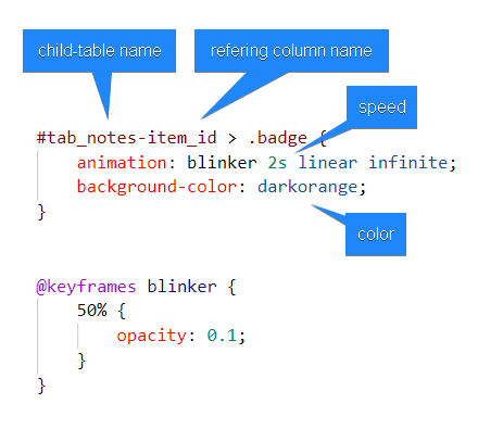
This is the CSS code for especially this notes-tab:
#tab_notes-item_id > .badge {
  animation: blinker 2s linear infinite;
  background-color: darkorange;
}

@keyframes blinker {
  50% { opacity: 0.1; }
}
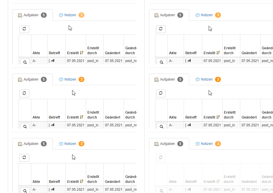
Result
Play video and watch the middle section which contains children tabs.
Well, maybe it's still too discrete, but better than before. I'm thinking of modifying my CSS a bit more so that it can't be missed
Did you notice that those children tabs are hidden in the beginning and fade in on mouse hover? Have a look at this post here.
Customize
Using very little CSS you can customize colors and animation as you like. Change the selector according to your tablename and fieldname:

Syntax: #tab_ + YOUR_TABLENAME + - + YOUR_COLUMNNAME
Hope you like it!
Extra Tipp
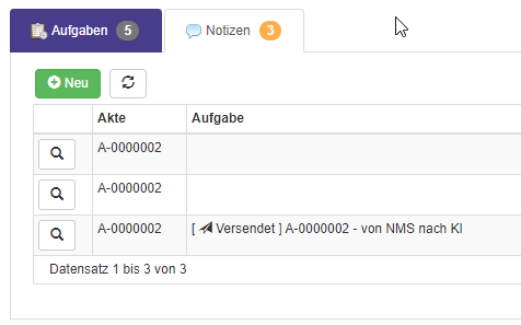
Did you know you can colourize the whole tab-caption?
#tab_tasks-item_id {
        background-color: darkslateblue;
        color: white !important;
    }


