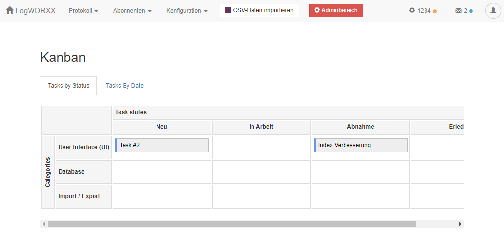
Custom pages are a great way to add any content to your app. If you have ever created your own custom pages, you may have noticed that quite a lot of space is wasted to the left and to the right of the actual content:

Do you see the useless margins? In this case, the content is even too wide for the content-container and a scrollbar appears at the bottom. That doesn't have to be!
With a simple trick you can widen the usable area. Just place that script in your custom page:
<!-- file: your_custom_page_file.php -->
<script>
    jQuery(".users-area.container").addClass("container-fluid").removeClass("container");
</script>
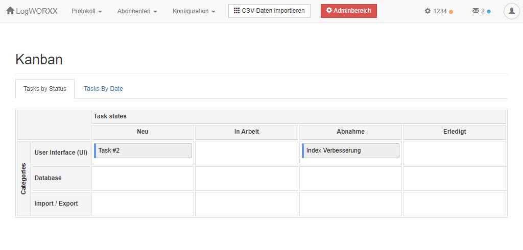
This gives you smaller margins on the left and right, so that you get more usable space.

In this case, I can gain enough space so that the actual content is fully visible.
Hope you like it!

